

Creating an app for an established business to help build audience
OCE
DATE:
January 16, 2020
CLIENT:
Fayne Carter
INFO:
Cajel.design
OCE Case Study

https://www.figma.com/proto/BAH5lpKOlsjhsX5CUIrGAL/OCE-Wireframe?node-id=1%3A2&scaling=min-zoo
1. Overview of the project:
Summary:
Oil change express was established in Louisville, KY in 2015, and due to growth needed an app for further exposure.
Roles and responsibilities:
I was tasked to create an app for Oil Change Express. By it being a new kind of service i started my research by first undergoing a competitive analysis to get a broader understanding of the industry i’m designing in. Next, I conducted user surveys and user interviews to get to know the users pain points and good experiences. From this i created an empathy map, journey map, persona, sketches, a user flow, wireframe, and prototype
Problem:
Client needed an app that could schedule appointments, take credit card payments, link to social media, and give users an easier means to contact business.
Audience:
Busy parents and professionals with no time to visit shop.
Solution:
I created an app with just enough simple features that will enable the user to be from landing page to appointment confirmation in less than five minutes.
2. Process: Discovery & Research:
Competitive Analysis:
First we completed a competitive analysis to give us a better feel of competitors in the industry. Here we used Yourmechanic.com a web based service that hires locals from each state. We found that many of our competitors customers are not satisfied with their service, so we plan to use convenience as our major gain to our users.

User Surveys:
User Surveys: taught us about our participants 50% of their pain points were waiting time, 50% of their most liked feature was when they could get in and get out. This gave us clarity that most are basically concerned with convenience, and that is what we put into our app convenience and simplicity to get them to check out quickly.


User Interviews:
Next we conducted user interviews and Our participants confirmed the data from our surveys and added a couple pointers for us to consider when constructing this app. No extra noise of any kind is needed when scheduling an oil change, so we eliminated it.they were also concerned about secure payment processing by this being a new business. Therefore our goal is to use insured and highly accredited payment processors like B.O.A., Citibank, or Wellsfargo so our users will feel secure when scheduling our services within our app.
User Persona:
Misty Warren
“I just want my oil changed, but don’t
have the time between work and kids.”

36
Pharmacist
Lives in Louisville, KY
Devout member of A.M.A
Motivations
Children
Career expansion
Commuinty Support
Goals
To schedule appointment
Quality on time service
To have oil changed at my
Location
Frustrations
No time to visit shop
Rude technicians
Terrible service
Local shops late appointments
Information Architecture:
User Flow
Next we created a user flow to map out our users steps to give them a faster and more meaningful experience. Our initial sketch had a step that could be omitted and thats what we did, eliminated all unnecessary steps in order to give our user a quicker experience and to get them to check out faster.


Information Architecture:
Story Board
Next we sketched a storyboard to anticipate the actions we want our users to take within our product.

Information Architecture: 4 Sketch Idea
Next we did a four up sketch to start ideating on the look and feel of the app. From the beginning of this stage is where we started planning to create steps that’s easy to follow and simple to allow the user a faster checkout.


We created a paper prototype to see the functioning of the app. This taught us that simplicity is the key to get this app off the ground, for by Oil Change Express is new so we eliminated all noise to ensure our users a clean and smooth experience.


3. High Fidelity Prototype:
https://www.figma.com/proto/BAH5lpKOlsjhsX5CUIrGAL/OCE-Wireframe?node-id=1%3A2&scaling=min-zoom
These are a few examples of what the final product looks like. We used some Gestalt principles of design; similarity to keep the product consistent in the minds of our users and proximity to give the user a sense of conducting formal business.


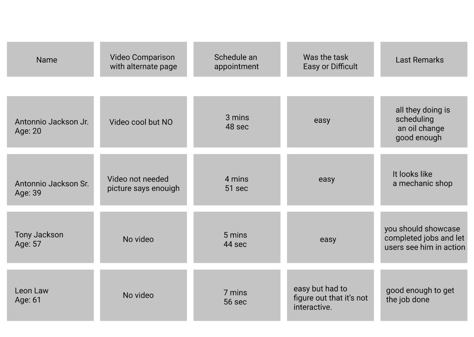
Usability Tests:
We initially went in with the idea to use a video as an opening on the landing page to give users a sense of OCE’s dedication but our testers informed us that no video is needed for once the user is on the app they’re there to make an appointment and the video was deemed noisy and unnecessary.


I asked participants to schedule an appointment, and it took an average of 4.5 mins. Now the prototype isn’t fully interactive but i told my participants to act as if they’re inputting their info to make the experience as real as possible. Again on average it took 4.5 minutes to schedule an appointment. I asked participants if the task was easy or difficult. They all stated easy for the information on screen was very easy to follow.
4. Final thoughts
Our finished product worked as planned, simple and to the point as was requested by the client. My client stated in the beginning that most of his clientele were single professional women, but research taught there was a broader target audience. So the next steps would be to interview his original audience to see why they love the service so much to see how we can grow that audience larger.
For more case studies follow the links below.
www.cajel.design/project/1love
If you’d like my services you can contact me:
Email: craigjackson@cajel.design
Phone: 909-771-3191