
Creating an app and branding for an app called 1Love
1Love
DATE:
March 26, 2021
CLIENT:
thinkful academy curriculum
INFO:
cajel.design
1Love Case Study

Mentor sign-up path and interface;
https://www.figma.com/proto/qiba5SQ22vqdCkUW2V02pw/1Love-highfidelity-prototype-MENTOR-PAGES?node-id=103%3A360&scaling=min-zoom
Member sign-up path and interface;
https://www.figma.com/proto/97srgGSZswetNcoqWcDdGe/1Love-highfidelity-prototype-MEMBER-PAGES?node-id=131%3A176&scaling=min-zoom
1.Overview of the project:
Summary:
1LOVE is an app geared to combine Chicago’s outreach organizations
for more collaborations to empower the at-risk youths to be more productive and stop shooting.
Roles and responsibilities:
I was tasked to create an app that someone could use. I created 1Love, an app that combines Chicago outreach organizations, and the youths that are directly or indirectly affected/involved in non-productive activities for growth and development. To gain insight on my users I conducted user surveys and user interviews to gather data on their pain points and good experiences. Next, I conducted a series of competitive analysis to gain a broader understanding of the industry I’m designing for. From the data gathered I created user personas, user stories, user flows, sitemaps, wireframes, and a prototype. I also created a brand for the app.
Problem:
Many incidents that lead to fatal violence are initiated/instigated on social media, and no one is addressing it. 1Love addresses this issue by giving outreach organizations their own digital platform to better serve the needs of at-risk youths, and will also alert the communities of areas of high crime to be avoided.
Audience:
Concerned parents, youths affected by violence, and the professionals
Who is working to solve it.
Solution:
I created 1Love with just enough simple features to allow mentors from multiple outreach organizations to connect to youths throughout the chicago land area for empowerment, and send alerts of high-crime areas to be avoided.
2. Process:
User Surveys
I started this process by conducting user surveys to empathize with our users. Here are the survey results with charts.
48.1% of participants reported knowing someone affected by gang violence
75% of participants know 0 - 25 people affected by gang violence
64.3% of participants reported to believe that 26 - 50% of gang violence is initiated on social media.
78.6% of participants reported that it’s highly important for creating new ways for outreach organizations and youths to connect and communicate frequently?
57.1% of participants reported that a separate medium that connects at-risk youths with community outreach leaders at the touch of a button can help lesson some of the gang violence.


User interviews:
While conducting user interviews, all participants stated in their own way that a separate app geared to empowering and influencing our youth is necessary for we’re losing way too many to a life of unproductivity. some participants also stated they believe more people in the community would become more involved in this dilemma if they saw more community outreach organizations working in conjunction with each other, and one goal of 1love is to bring these community organizations together where they can collaborate on a platform solely created for them and our youth.
Competitive Analysis:
I completed three competitive analyses to gain further insight into my competitors in the industry. 1Love falls under a category of it’s own for there’s no app dedicated to one particular cause of stopping violence, however, there are similarities. Therefore when performing my competitive analysis i used three different kinds of social media apps: facebook, a social networking app, reddit, a discussion app, and wechat, a messaging app.
Facebook has millions of users and has become a household name ,yet it has a 2.7 customer review rating and is widely known to be a medium where many shootings in Chicago were initiated and instigated. 1love will compete with that by becoming the only app geared toward ending the social dilemma of gang violence by using a simple layout for easy navigation with content that only projects our number one ideal 1love. and from the data revealed I strongly believe it too will become a household name.:

Next we compared reddit, a discussion social media app. Many of it’s community users do not appreciate some of its content, users expressed a poor user interface, features dysfunctioning, and again it does not express any words of actions to be taken in helping cease some of the violence happening here in chicago and many other major cities. 1Love ensures all content will only express our name, slogan, and goal of spreading 1love to our communities, and will only use a simple and intuitive interface that can be easily navigated.

Lastly, we compared wechat, a messaging social media app. Wechat has a billion users worldwide yet maintains a 3.6 customer review rating. users expressed their sign-up was mind boggling and turned many angry. Again, I ensure that 1Love’s user interface will only address our task at hand 1love and ensure the simplest layout for the easiest navigation.

User persona:
From the data gathered thus far, I created three personas, each one personifying my target audience.
Jennifer, 37. Chicago, Il
“I want to help create a better tomorrow for our youth, and help provide housing, shelter, jobs, training and education, vocational training, science, technology and so much more. “

Pain:
“ It pains me to see our children dying daily over nonsense.
” Children can’t play outside anymore without the constant threat of violence.
” The systemic neglect of communities of color; and a lack of economic, educational and health — physical and mental — resources.”
” Lack of proper funding to fully provide all necessary resources.
” Communities traumatized by gun violence need mental health care, not more cops. “
” Generations of racist policies have abandoned entire pockets of the city to a level of trauma more often seen in warzones around the world, creating cycles of poverty, violence and trauma..
“ To see the agony in mothers who have lost children to gang violence. “
Wants:
“ To see children thriving and being able to live the life of a normal child. ”
“ To see children suffering from PTSD get proper psychological treatment. ”
“ A more productive community with more programs geared toward training children how to escape the life of gang membership. “
“ A better life for our children.”
Needs:
“ More governmental input into the crisis traumatizing the minority communities. “
” A plan that unites all community outreach programs to better serve the children whose lives we’re trying to save. “
” More members of the community to come out and face this issue head on. “
“ More ex-offenders and ex-gang members to come out and teach the youth the truth on how they’re destroying their lives. “
Next we have Barbara, she’s 31, works as a nurse at the university of chicago.
“I’ve seen too much violence in my life and I just want to be in a place where I don’t have to constantly worry about the safety of my children. “

Pain:
“ Gang violence confined within my community. ”
” Unemployment and poverty rate. ”
” To see the agony in mothers who have lost children to gang violence. ”
” The grief and fear seen in the faces of our children affected by this crisis . ”
” to see the communities constantly spiraling downwards into further destitution.”
“ profiling; police harassment of the wrong individuals, arresting people, putting handcuffs on people, is a temporary Band-Aid for a larger problem. “
“ The thought that my child may get involved in something, “
Wants:
“ A safer environment for my children. ”
“ A community where the neighbors work more together to instill love, values and commitment within our children. “
“ A better approach at educating our children that will prepare them for the now as well as for the future, “
“ Not to have to worry so much about my children’s welfare. “
Needs:
“ parents, schools, neighborhoods, and a wide range of other entities and support systems to work together. ”
” Ex gang members to reach out to the youth and point out where they’re wrong at. ”
” A united front of all outreach programs to better serve the needs of our children. ”
Finally we have montrell, he’s 21 and a college student studying computer engineering at devry.
“I just wanna survive long enough to finish college, get a job and move away from here to somewhere I don’t have to worry about dying.”

Pain:
“ Seeing violence constantly erupt everywhere I go. ”
” All the deaths I’ve heard and encountered within the last eight years of my life. ”
” Seeing a few of my friends I grew up with playing baseball become incarcerated with long sentences. ”
” Seeing people I’m in school with get transformed from a good academic student to one engulfed in the streets caused from a traumatic event . ”
” sometimes feeling like I’m living in fear, because you never know when
Wants:
“ To finish college get a job and be productive. ”
“ To help his friends get out of the street life and become more productive. “
“ To see more effort being put forth by everybody to see the end of this shooting crisis. “
“ To be a survivor and help others survive while living through this crisis. “
Needs:
“ A more empowered community with focuses of economic growth. ”
” Family, friends, and community support to stay focused with continuing education. ”
” Places to go hangout that’s not infested not infested with the idealogy of street life. ”
“ Jobs to help young people stay busy. “
Information Architecture:
User Flows:
Here I started ideating on the paths users will take, so I created five user flows to capture every step in the process of sign-up to posting on the feed. I knew I had to create two separate sign-up paths one for a member and one for mentors. our goal was to keep it easy to follow with a very simple interface that’s also aesthetically pleasing.
The first user flow was a general idea from landing page to sign-in or sign-up

The second user flow was more iterations to the sign-up process. and it was here i started ideating on how to get members completely signed-up in four steps.

The third user flow has more iterations on the sign-up process for mentors. Here I realized I can have mentors signed-up and ready to post in five steps.

Here i iterated the process of signing-in to include tolerance for error in case a user accidentally types in the wrong information.

The fifth and final user flow. After sketching and defining all paths I wanted users to take I digitized it. Here I finalized the process for mentors and members, with mentors fully signed up and ready to post within five steps from the landing page, and members signed up in four steps from the landing page.


Information Architecture:
Sitemaps
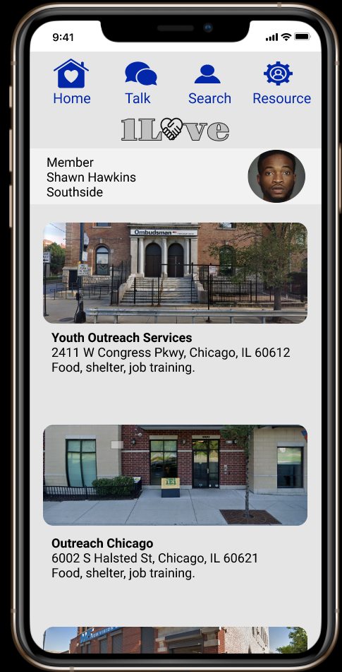
Here i started ideating on a sitemap. Initially I was leaning toward using a hamburger menu and a navbar, and I outlined the resources tab and organizations tab to be separate components. i realized this would be too noisy so I created one tab called resources, and it lists outreach organizations with the services they provide. After further iterations I decided to just go with a navbar with four tabs, home, talk for the chat feature, search to find other members or mentors to chat with, and a resources tab which lists the organizations and provides information on what services they offer.


Information Architecture:
Wireframes
Here I started sketching ideas on the landing page, the site rules page that explains our site will not tolerate any forms of violent speech nor any forms of disrespect, the first draft of the mentors 1st sign-up screen. From the beginning the goal was simplicity and that is what I aimed to create.

I further drafted two more mentor signup pages with the idea of creating fill forms that were casual, business quality and easy to follow. This was also the first draft of a simple user home interface for mentors.

The first iteration of the mentors home page where I started ideating on creating a hierarchy of importance by highlighting the send alert button.

Ideating on the layout for the resources page.

Final iterations for site rules page. brief and straight to the point with options to sign up as a mentor or member. and on our mentor and member interfaces we enlarged our buttons for accessibility.
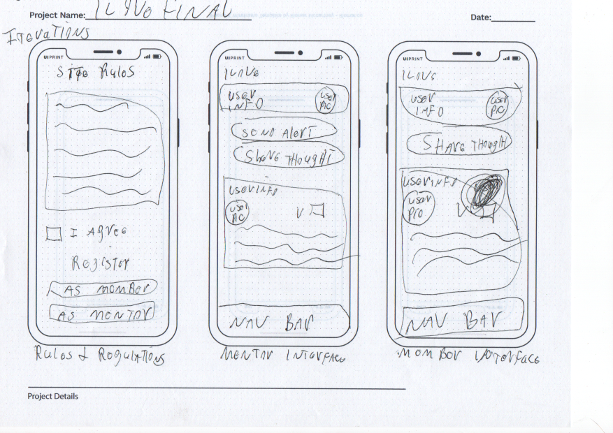
Final iterations for resources and chat pages. This is where I started planning on enlarging the navbar link components, and calls to action throughout the interface for easy accessibility while keeping the interface simple and easy to follow.


Branding:
In the next step of this process was branding the app. So I created a mood board that conveys the entire purpose of this app, and to give me inspiration on how to create a logo that does the same, convey the message of stopping violence.

Ideation sketches for a logo.

Digitized, some with a little color just to see its output, however i knew i had to use neutral colors for majority of the audience sought are those who associate certain colors with specific types of memberships, therefore i kept it neutral and balanced.well in the drafts i created one that spells out our mission.

Here I created a simple style guide for our initial start up.
we used gravitas one for our logo text for its bold with an artsy kind of flair. I replaced the ‘o' in love with the hands coming together making a heart to symbolize making a friend, love a friend, learn to forgive. We used colors of black and grey for our logo to create a relaxed neutral kind of feel.
We used source code pro as our sign-up screens header to create a good visual hierarchy, and roboto for all other text uses.

3. High-fidelity prototype:
FIrst prototype:


Final iterated prototype:
Mentor sign-up path and interface;
https://www.figma.com/proto/qiba5SQ22vqdCkUW2V02pw/1Love-highfidelity-prototype-MENTOR-PAGES?node-id=103%3A360&scaling=min-zoom
Member sign-up path and interface;
https://www.figma.com/proto/97srgGSZswetNcoqWcDdGe/1Love-highfidelity-prototype-MEMBER-PAGES?node-id=131%3A176&scaling=min-zoom
Based on feedback from other designers I made a few iterations. Instead of a peace sign for the like button on posts I used a heart for it matches the iconic logo symbol. I made changes to the upload button for it was outdated and looked more like it was only for documents. I changed the navbar search icon from a person to a magnifying glass for easier recognition. I also iterated the chat screen to be more organized and easier to follow a chat. I centered all of my c.t.a.’s to better match industry standards and made sure they were all the same size for consistency.


Usability testing:
I asked participants which interface is more pleasing. The green accented or the blue? 65% stated the blue.

I asked participants to sign up as mentors and members and to create alerts as mentors and create posts as members. Signing up, creating alerts, and posts were all deemed easy and very simple for they were able to follow the flow of information easily. I asked participants for any last remarks and 111% stated they’d like to see it live just to see if it can be used to limit some of the gang violence here in Chicago.

4. Final thoughts:
From the feedback received from other UI designers and the participants of my studies this app can go so much further due to its potential. Therefore, the next steps should be to further research into all the outreach centers to see if they’d like they’re own channel on the app to interact with their clients.
Research into establishing online education classes for G.E.D and personal computing,etc. Based on the data, I learned that a substantial amount of people want to see new ways of using social media as a means to stop gang violence, and that more people are willing to get involved if they see more community outreaches working in conjunction. Creating this site also taught me that I have an inner desire to help, for there were obstacles that made this process frustrating, but my love for the concept and design kept me moving forward to completion.
For more case studies follow the links below.
If you’d like my services you can contact me:
Email: craigjackson@cajel.design
Phone: 909-771-3191